Site logo ideas?
-
JediTricks

- Site Admin
- Posts: 3851
- Joined: Thu Jul 17, 2008 12:17 pm
- Location: LA, CA, USA
Site logo ideas?
I feel like the work isn't up to snuff, but I am very critical of my work, especially when I don't have fully formed ideas - which right now, I am very much missing. Anyway, here's the only concept I've actually pulled all the way out of my ear. Any ideas would be helpful.

See, that one's a camcorder, that one's a camera, that one's a phone, and they're doing "Speak no evil, See no evil, Hear no evil", get it?
-
andersonh1
- Moderator
- Posts: 6485
- Joined: Fri Jul 18, 2008 3:22 pm
- Location: South Carolina
Re: Site logo ideas?
Hey, logo design. Why not go with a variety of insignia eyes instead of the full face, to go with the 'views' theme? Maybe inset inside the type?
Let me see if I can come up with an idea along those lines and see what you think.
Let me see if I can come up with an idea along those lines and see what you think.
Re: Site logo ideas?
I like it. Good use of the major faction sigils. (The only American factions that I can see missing are Dinobots and Mutants, along with the G2 'bot and 'con sigils.)
The one thing I would change is the sequence of sigils.
Autobot
Decepticon
Maximal
Predacon
Vehicon
Minicon
Dom
The one thing I would change is the sequence of sigils.
Autobot
Decepticon
Maximal
Predacon
Vehicon
Minicon
Dom
-
JediTricks
- Site Admin
- Posts: 3851
- Joined: Thu Jul 17, 2008 12:17 pm
- Location: LA, CA, USA
Re: Site logo ideas?
Thanks for the feedback guys.
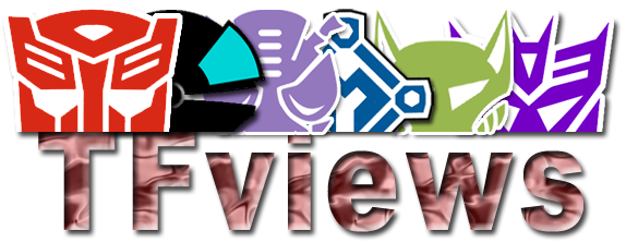
It's a rough, so ignore the border issues on some of them. I think I like it, it feels like it needs some tweaking (any ideas there would be hot) but conceptually I think it's solid despite the minicon and vehicon logos not having eyes.
DEFINITELY need a font suggestion. My first instinct is to not do the same Transformers font as everybody else, but I do suck verily with font choices. And that metal pattern doesn't work too well I fear. If you see logos you like, TF-themed or not, please link me to them.
As for the order, I had considered that, I even halved each one vertically so they'd merge together, but I didn't like the parings in any combination so I decided to go "beginning and end with G1" because, let's be honest, that's what a lot of fans recognize first and foremost. I also toyed with faction brethren together, but Vehicon and Minicon aren't brethren so it petered out. And putting Vehicon and Minicon together also presents a problem that they are boring visually on their own, they don't bring any color to the party (BTW, I had to do a ton of color-correct for every single logo except for the minicon one). Besides, the statement with them not paired up is that as fans of different eras, we CAN coexist together.
Eyes is an interesting idea, but the Predacon eyes are so much bigger, and the Vehicon and Minicon logos don't have eyes. Still, it's a good concept, I like that it's not just "here's some logos" but takes it to the next level. What do you think of this?...andersonh1 wrote:Hey, logo design. Why not go with a variety of insignia eyes instead of the full face, to go with the 'views' theme? Maybe inset inside the type?
Let me see if I can come up with an idea along those lines and see what you think.
It's a rough, so ignore the border issues on some of them. I think I like it, it feels like it needs some tweaking (any ideas there would be hot) but conceptually I think it's solid despite the minicon and vehicon logos not having eyes.
DEFINITELY need a font suggestion. My first instinct is to not do the same Transformers font as everybody else, but I do suck verily with font choices. And that metal pattern doesn't work too well I fear. If you see logos you like, TF-themed or not, please link me to them.
IMO, Dinobots and Mutants were unused factions that nobody identifies with anyway, the Mutants faction logo is unrecognizable as Transformers, and I don't even think the Dinobots had a faction logo as the toys were all Maximals.Dominic wrote:I like it. Good use of the major faction sigils. (The only American factions that I can see missing are Dinobots and Mutants, along with the G2 'bot and 'con sigils.)
The one thing I would change is the sequence of sigils.
Autobot
Decepticon
Maximal
Predacon
Vehicon
Minicon
Dom
As for the order, I had considered that, I even halved each one vertically so they'd merge together, but I didn't like the parings in any combination so I decided to go "beginning and end with G1" because, let's be honest, that's what a lot of fans recognize first and foremost. I also toyed with faction brethren together, but Vehicon and Minicon aren't brethren so it petered out. And putting Vehicon and Minicon together also presents a problem that they are boring visually on their own, they don't bring any color to the party (BTW, I had to do a ton of color-correct for every single logo except for the minicon one). Besides, the statement with them not paired up is that as fans of different eras, we CAN coexist together.
See, that one's a camcorder, that one's a camera, that one's a phone, and they're doing "Speak no evil, See no evil, Hear no evil", get it?
-
andersonh1
- Moderator
- Posts: 6485
- Joined: Fri Jul 18, 2008 3:22 pm
- Location: South Carolina
Re: Site logo ideas?
I think that definately starts to create a focus on the optics. I've put together a couple of logo idea variations of my own in my free time today, and I'll upload them and give you the links when I get home later this evening.
Re: Site logo ideas?
Ah. I see.
We might want to include G2 Decepticons and Autobots though. The Decepticons were used for the Cybertronian Empire and the Autobot sigil was used for some Autobots, as well as Scourge's Decepticons from RiD.
Similarly, there is a "United Cybertron" sigil, combining Autobot and Decepticons. It is from one of the comics.
Finally, the Dinobots did have a sigil, a dino skull.
Still, I like the logo as it is.
Dom
-is happy just to see Vehicons get some attention.
-
JediTricks
- Site Admin
- Posts: 3851
- Joined: Thu Jul 17, 2008 12:17 pm
- Location: LA, CA, USA
Re: Site logo ideas?
Anderson, if you need an easy upload site, try www.imageshack.us I use them for my personal stuff, they don't even require joining, you can go to the site and upload right from the front page.
Oh yeah, they had a silhouette side view of a triceratops head in a circle, it wasn't even a skull, it sucked too IMO and isn't TF-recognizable.
G2 logos are a bit... um... crappy. There, I said it. The Decepticon one ain't too bad, but the Autobot one is embarrassing. I found this resource with them and your half-n-half one: http://www.shmax.com/Faction_Guide
These aren't particularly big, and yet for G2 they're the biggest and clearest I can find, which means I'd have to reproduce them, and I don't like them enough to get into that mess for this, not right now anyway.
I forgot to use the Beast Machines Maximal logo, and now that I know it... I'm still not using it. It's too narrow, wouldn't fit well.
"From one of the comics" means it's hard to reproduce or find a high-quality version of.Dominic wrote:Ah. I see.
We might want to include G2 Decepticons and Autobots though. The Decepticons were used for the Cybertronian Empire and the Autobot sigil was used for some Autobots, as well as Scourge's Decepticons from RiD.
Similarly, there is a "United Cybertron" sigil, combining Autobot and Decepticons. It is from one of the comics.
Finally, the Dinobots did have a sigil, a dino skull.
Still, I like the logo as it is.
Dom
-is happy just to see Vehicons get some attention.
Oh yeah, they had a silhouette side view of a triceratops head in a circle, it wasn't even a skull, it sucked too IMO and isn't TF-recognizable.
G2 logos are a bit... um... crappy. There, I said it. The Decepticon one ain't too bad, but the Autobot one is embarrassing. I found this resource with them and your half-n-half one: http://www.shmax.com/Faction_Guide
These aren't particularly big, and yet for G2 they're the biggest and clearest I can find, which means I'd have to reproduce them, and I don't like them enough to get into that mess for this, not right now anyway.
I forgot to use the Beast Machines Maximal logo, and now that I know it... I'm still not using it.
See, that one's a camcorder, that one's a camera, that one's a phone, and they're doing "Speak no evil, See no evil, Hear no evil", get it?
-
andersonh1
- Moderator
- Posts: 6485
- Joined: Fri Jul 18, 2008 3:22 pm
- Location: South Carolina
Re: Site logo ideas?
Imageshack is a good site that I use frequently. My problem at the moment is the content filter at work that won't let me get to it, or most other sites for that matter. It's pretty restrictive. Frankly I'm surprised I can view TFviews at work!JediTricks wrote:Anderson, if you need an easy upload site, try http://www.imageshack.us I use them for my personal stuff, they don't even require joining, you can go to the site and upload right from the front page.
I can post my ideas directly here in the forum if you want, I just didn't want to step on your toes since this is your project. Or I can just pm you with the links when I upload them later. Either one is fine with me.
-
Prime_Wreck

- Deluxe
- Posts: 86
- Joined: Tue Sep 23, 2008 2:41 pm
- Location: The other room
- Contact:
Re: Site logo ideas?
It might look good too if you put three of the logos above and three below the site name.
Maybe Autobot, Maximal. Mini-Con above, and then Decepticon, Predicon, Vehicon below.
Maybe Autobot, Maximal. Mini-Con above, and then Decepticon, Predicon, Vehicon below.
"Supersizing your Value Meal is the right of all sentient beings"
-
Onslaught Six

- Supreme-Class
- Posts: 7023
- Joined: Fri Jul 18, 2008 6:49 am
- Location: In front of my computer.
- Contact:
Re: Site logo ideas?
Never did like the Autobot one, but the Decepticon logo rules because IT IS BASED ON CLENCH HOLY SHIT. I want that thing between my pickups on my guitar.JediTricks wrote:G2 logos are a bit... um... crappy. There, I said it. The Decepticon one ain't too bad, but the Autobot one is embarrassing.
...wait, are you serious?These aren't particularly big, and yet for G2 they're the biggest and clearest I can find, which means I'd have to reproduce them, and I don't like them enough to get into that mess for this, not right now anyway.
Dude. Wiki.
http://tfwiki.net/wiki/Insignia
Ditch the Minicon logo for the G2 'Con one. Yeah, that makes it slightly unbalanced, Vehicons and all, but the Autobot logo is in the front which gives it more focus anyway. As for the font, well, you could use any stock TF font for it. Yeah, they're TF Stock Fonts and everyone and their mother uses it--but that's 'good' because it provides brand identity and stuff. Hell, HISSTank's forums have a giant GI JOE logo at the top of every page with a little red bit in Generic Movie Font.
People spend so much time worrying about whether a figure is "mint" or not that they never stop to consider other flavours.BWprowl wrote:The internet having this many different words to describe nerdy folks is akin to the whole eskimos/ice situation, I would presume.
