
It reads like "Dom" is the last sigil. What's your faction sigil look like, Dom? Are you called Domnibots?Dominic wrote: Autobot
Decepticon
Maximal
Predacon
Vehicon
Minicon
Dom
Site logo ideas?
Re: Site logo ideas?
.................................................................................................................................................................... _,_,_..
...................................................................................................................................................................(..vvvvv
..................................................................................................................................................................(..../"/"
.........................................................................................................................................................(\.....(.....) )
......................................................................................................................................................... \ \../../hh hh
-
JediTricks

- Site Admin
- Posts: 3851
- Joined: Thu Jul 17, 2008 12:17 pm
- Location: LA, CA, USA
Re: Site logo ideas?
My guess is because we're new and have no content, it's fairly off the radar at your work.andersonh1 wrote:Imageshack is a good site that I use frequently. My problem at the moment is the content filter at work that won't let me get to it, or most other sites for that matter. It's pretty restrictive. Frankly I'm surprised I can view TFviews at work!
Interesting idea, but I don't want to have a tall logo right now. That was another thing I really liked about Anderson's "eyes" idea, it tightened it up nicely.Prime_Wreck wrote:It might look good too if you put three of the logos above and three below the site name.
Maybe Autobot, Maximal. Mini-Con above, and then Decepticon, Predicon, Vehicon below.
I actually don't think it is based on Clench beyond that diamond crest above the eyes, take a look: http://tfu.info/1993/Decepticon/Clench/clench.htmOnslaught Six wrote:Never did like the Autobot one, but the Decepticon logo rules because IT IS BASED ON CLENCH HOLY SHIT. I want that thing between my pickups on my guitar.
Not that I don't appreciate the ideas and resource, but is there a reason everything you say has to be said in the most douchey manner possible?...wait, are you serious?
Dude. Wiki.
http://tfwiki.net/wiki/Insignia
Ditch the Minicon logo for the G2 'Con one. Yeah, that makes it slightly unbalanced, Vehicons and all, but the Autobot logo is in the front which gives it more focus anyway. As for the font, well, you could use any stock TF font for it. Yeah, they're TF Stock Fonts and everyone and their mother uses it--but that's 'good' because it provides brand identity and stuff. Hell, HISSTank's forums have a giant GI JOE logo at the top of every page with a little red bit in Generic Movie Font.
BTW, what's the deal with there being another TF wiki with the same logo and mostly the same content? I usually use Teletraan-I:
http://transformers.wikia.com/wiki/Insignia
Here's another page that is identical (except for the edit I just made about BWTF returning in October, specifically to see if they were the same database, which they aren't):
http://tfwiki.net/wiki/Ben_Yee
http://transformers.wikia.com/wiki/Ben_Yee
Anyway, Ditching the minicon logo just to put in one you like more is not going to happen. Nothing says "everybody's welcome" like tossing a faction's logo so you can have a second Decepticon logo. I may include it at the end if we do 1 faction for every letter like Anderson suggested, but I do prefer his idea of using the Beast Machines Maximal logo since it's red and helps this rather cold logo warm up. And it didn't make a big showing in the toys, only packaging.
I really didn't want to use a TF font, it's been done to death and they're not particularly great-looking designs outside of the word "TransFormers". They're also not wide fonts which is usually very helpful. But I will consider it.
Haw, that's awesome! I think he'd be closer to the Omnicons though, I seem to remember him being kinda happy with the Energon build-an-army TFs.donosaur wrote:It reads like "Dom" is the last sigil. What's your faction sigil look like, Dom? Are you called Domnibots?Dominic wrote: Autobot
Decepticon
Maximal
Predacon
Vehicon
Minicon
Dom

See, that one's a camcorder, that one's a camera, that one's a phone, and they're doing "Speak no evil, See no evil, Hear no evil", get it?
-
JediTricks
- Site Admin
- Posts: 3851
- Joined: Thu Jul 17, 2008 12:17 pm
- Location: LA, CA, USA
Re: Site logo ideas?
Ok, taking some more of your guys' input, I've come up with a few ideas. Right now I can't decide which of them I'm aiming for, so take a look at these roughs (keep in mind, VERY ROUGH mostly) and let's hear what ya got...
(sorry on the width overrun of these, wasn't thinking about presentation of roughs. They're linked so you can see the whole thing.)
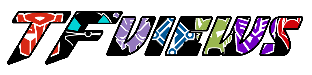
(slightly different from last one, more like Anderson's idea)
(alternate colors in the bg)
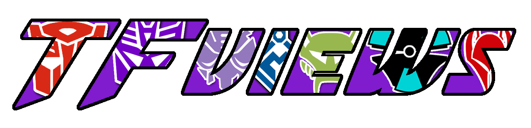
(taking my eariler concept and applying Onslaught's font recommendation)
(and a reshaping of the font into something I prefer. The lining up on "views" is incidental, it was meant to center up against the "TF" like in the above ones)
I kind of like the last one, despite its relative simplicity. Angling and fattening up the font helped a lot, and the "eyes" concept really grabs me. So far, everybody's been a big help, and the more input on this, the better this will be, I think.
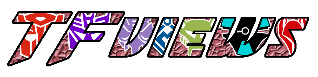
(sorry on the width overrun of these, wasn't thinking about presentation of roughs. They're linked so you can see the whole thing.)
(slightly different from last one, more like Anderson's idea)
(alternate colors in the bg)
(taking my eariler concept and applying Onslaught's font recommendation)
(and a reshaping of the font into something I prefer. The lining up on "views" is incidental, it was meant to center up against the "TF" like in the above ones)
I kind of like the last one, despite its relative simplicity. Angling and fattening up the font helped a lot, and the "eyes" concept really grabs me. So far, everybody's been a big help, and the more input on this, the better this will be, I think.
See, that one's a camcorder, that one's a camera, that one's a phone, and they're doing "Speak no evil, See no evil, Hear no evil", get it?
-
Onslaught Six

- Supreme-Class
- Posts: 7023
- Joined: Fri Jul 18, 2008 6:49 am
- Location: In front of my computer.
- Contact:
Re: Site logo ideas?
Ehh, this has been established for a while now in the Crazy Onslaught Fanwank Universe where 86 and I live. Where RID fits into Japanese BW and Scourge is Laser Prime.JediTricks wrote:I actually don't think it is based on Clench beyond that diamond crest above the eyes, take a look: http://tfu.info/1993/Decepticon/Clench/clench.htm
I figured that you would've clearly checked the Wiki first as it's a kickass resource.Not that I don't appreciate the ideas and resource, but is there a reason everything you say has to be said in the most douchey manner possible?
Wikia (who hosted Teletraan-1) apparently are douchebags about their ads and other such crap, so Walky and the other admins uprooted all the articles and took them to a new server and slapped some new paint on it. I'm supporting their move because...well, it's more likely to keep getting updated. Meanwhile, I'm over on the old Wiki doing all kinds of crazy shit like saying Primal has a Matrix.BTW, what's the deal with there being another TF wiki with the same logo and mostly the same content? I usually use Teletraan-I:
http://transformers.wikia.com/wiki/Insignia
Here's another page that is identical (except for the edit I just made about BWTF returning in October, specifically to see if they were the same database, which they aren't):
http://tfwiki.net/wiki/Ben_Yee
http://transformers.wikia.com/wiki/Ben_Yee
It was more on the case that the G2 Decepticon logo has eyes while the Minicon logo does not. The Vehicon's atomic symbol design sorta-kinda has them. I don't see where the BM Maxi logo is red, though--the BM faction logos were colour-neutral in spite of the red seemingly being applied to it at some arbitrary point--and probably to keep it in line with the BW Maxi logo somehow becoming red at some point.Anyway, Ditching the minicon logo just to put in one you like more is not going to happen. Nothing says "everybody's welcome" like tossing a faction's logo so you can have a second Decepticon logo. I may include it at the end if we do 1 faction for every letter like Anderson suggested, but I do prefer his idea of using the Beast Machines Maximal logo since it's red and helps this rather cold logo warm up. And it didn't make a big showing in the toys, only packaging.
People spend so much time worrying about whether a figure is "mint" or not that they never stop to consider other flavours.BWprowl wrote:The internet having this many different words to describe nerdy folks is akin to the whole eskimos/ice situation, I would presume.

-
JediTricks
- Site Admin
- Posts: 3851
- Joined: Thu Jul 17, 2008 12:17 pm
- Location: LA, CA, USA
Re: Site logo ideas?
I did, I typed a few things and ultimately just went with "factions", but "insignia" wasn't one of them.Onslaught Six wrote:I figured that you would've clearly checked the Wiki first as it's a kickass resource.
Ah, ok. That should turn into a mess, especially when someone copies all the crazy shit on Teletraan and posts it to TFwiki.Wikia (who hosted Teletraan-1) apparently are douchebags about their ads and other such crap, so Walky and the other admins uprooted all the articles and took them to a new server and slapped some new paint on it. I'm supporting their move because...well, it's more likely to keep getting updated. Meanwhile, I'm over on the old Wiki doing all kinds of crazy shit like saying Primal has a Matrix.
Yeah, I know, but the page YOU linked to had it red, plus many of the spark crystals were red toned. Eyes are hard to see though. And the G2 Decepticon logo wasn't a specific color either, and there's no way I'm using the packaging color - what were they thinking, neon orange and purple?!? But you make a point about eyes, wish you had said that earlier, now I need more feedback.It was more on the case that the G2 Decepticon logo has eyes while the Minicon logo does not. The Vehicon's atomic symbol design sorta-kinda has them. I don't see where the BM Maxi logo is red, though--the BM faction logos were colour-neutral in spite of the red seemingly being applied to it at some arbitrary point--and probably to keep it in line with the BW Maxi logo somehow becoming red at some point.
See, that one's a camcorder, that one's a camera, that one's a phone, and they're doing "Speak no evil, See no evil, Hear no evil", get it?
-
andersonh1
- Moderator
- Posts: 6332
- Joined: Fri Jul 18, 2008 3:22 pm
- Location: South Carolina
Re: Site logo ideas?
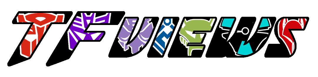
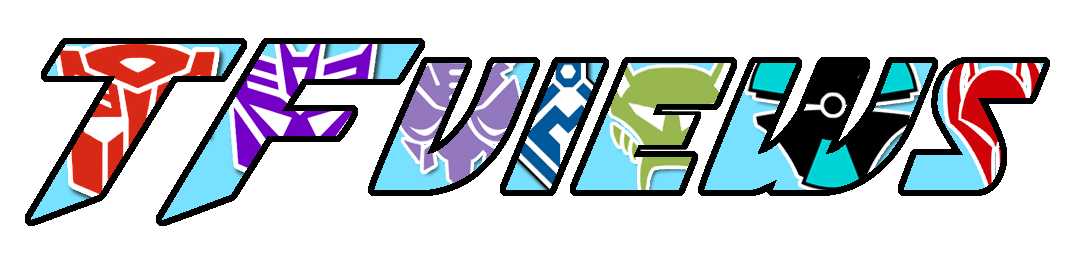
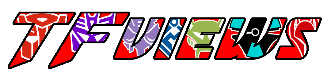
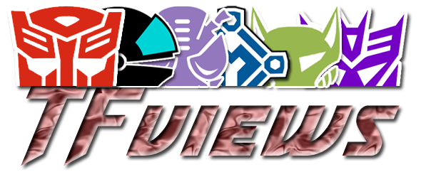
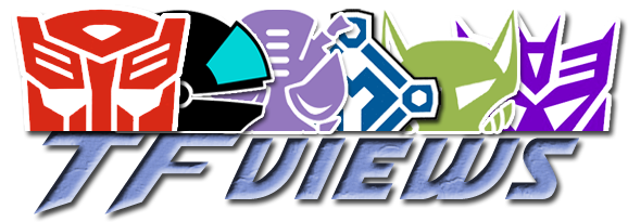
I like the new typestyle. I'm leaning towards the last logo at the moment, the one with the blue TFViews under the half-insignias. But I think there needs to be some way to tie the two elements together. Right now it's a bunch of faces sitting on top of some type. I'm not seeing them as one cohesive logo just yet.
I still like the insignias inside the letters idea, but the problem I'm having with all of them is that the very bright logos all compete for attention, at least the way I see it, and make the words more difficult to read. The thick black outline helps, but it's still very busy.The one that works the best is the logo with the light blue background, since it provides the lowest contrast between the foreground and background.
I wonder how making each letter a separate color would look? Make each letter the same color as the insignia inside it, and keep the black outline to tie it all together? That may not be the solution to the problem, but it might work.
-
onslaught86

- Moderator
- Posts: 1273
- Joined: Thu Jul 17, 2008 3:02 pm
- Location: EnZed
- Contact:
Re: Site logo ideas?
I like the words with chewy faction symbol centres, myself, definitely with the black background. It's elegant in its simplicity and instantly recognisable.
-
Onslaught Six
- Supreme-Class
- Posts: 7023
- Joined: Fri Jul 18, 2008 6:49 am
- Location: In front of my computer.
- Contact:
Re: Site logo ideas?
Ah, I see. I frequent the Wiki out of boredom, though, so I've seen most of the pages that have stuff like that. Mind, a Google Image search for G2 Decepticon gives up the Wiki as the second result...JediTricks wrote:I did, I typed a few things and ultimately just went with "factions", but "insignia" wasn't one of them.
No, because nobody's gonna do that. Both Wikis are independent now, despite sharing a lot of the same content currently.Ah, ok. That should turn into a mess, especially when someone copies all the crazy shit on Teletraan and posts it to TFwiki.
Hmm, I guess it does. Oh well--I never liked the BM Maxi logo too much anyway. <.< I always preferred the G2 symbols coloured like the G1 ones, anyway.Yeah, I know, but the page YOU linked to had it red, plus many of the spark crystals were red toned. Eyes are hard to see though. And the G2 Decepticon logo wasn't a specific color either, and there's no way I'm using the packaging color - what were they thinking, neon orange and purple?!? But you make a point about eyes, wish you had said that earlier, now I need more feedback.
People spend so much time worrying about whether a figure is "mint" or not that they never stop to consider other flavours.BWprowl wrote:The internet having this many different words to describe nerdy folks is akin to the whole eskimos/ice situation, I would presume.
-
JediTricks
- Site Admin
- Posts: 3851
- Joined: Thu Jul 17, 2008 12:17 pm
- Location: LA, CA, USA
Re: Site logo ideas?
I got the exact same feedback from an outside source last night. I guess the eyes hovering over the letters no longer translates, so it truly is disconnected. I like that it's transparent, but maybe a border around all that could work, I dunno.andersonh1 wrote:I like the new typestyle. I'm leaning towards the last logo at the moment, the one with the blue TFViews under the half-insignias. But I think there needs to be some way to tie the two elements together. Right now it's a bunch of faces sitting on top of some type. I'm not seeing them as one cohesive logo just yet.
Well, we could tone down the insignia, but ultimately, I feel like the words truly are difficult to read with that stuff going on inside. You're right that the blue works best, but I don't really feel anything for that logo, I keep wanting to because I like the concept.I still like the insignias inside the letters idea, but the problem I'm having with all of them is that the very bright logos all compete for attention, at least the way I see it, and make the words more difficult to read. The thick black outline helps, but it's still very busy.The one that works the best is the logo with the light blue background, since it provides the lowest contrast between the foreground and background.
Nooo, that'd be a jumble, that'd take the cogent theme between them and toss it on its ear. It's already a bit jumbly for my tastes with the logos being different colors.I wonder how making each letter a separate color would look? Make each letter the same color as the insignia inside it, and keep the black outline to tie it all together? That may not be the solution to the problem, but it might work.
I wasn't looking for the G2 Decepticon logo tho'.Onslaught Six wrote:Ah, I see. I frequent the Wiki out of boredom, though, so I've seen most of the pages that have stuff like that. Mind, a Google Image search for G2 Decepticon gives up the Wiki as the second result...
To be honest, if I use the G2 'Con logo, it won't be purple because we already have so much purple. I was thinking of a milder orange and lavender, but I dunno, it's frustrating because the eyes would help - I'd probably cut the Vehicon logo and keep the Minicon, as I don't like the BM maximal logo much either, and it's hard as hell to work with for the "eyes" concept. Then again, the Vehicon logo does have a slight sense of "eyes" to it, the aqua part.Hmm, I guess it does. Oh well--I never liked the BM Maxi logo too much anyway. <.< I always preferred the G2 symbols coloured like the G1 ones, anyway.
See, that one's a camcorder, that one's a camera, that one's a phone, and they're doing "Speak no evil, See no evil, Hear no evil", get it?
Re: Site logo ideas?
Here is my faction sigil:donosaur wrote:
It reads like "Dom" is the last sigil. What's your faction sigil look like, Dom? Are you called Domnibots?
)*(
It is a tuchus. I like to moon. My TF name is Rec-Dom.
Okay, that being out of the way, I can see what O6 is saying about the MInicon sigil not having eyes. But, the problem is that if we remove the MInicon sigil, we are basically saying the forums are for fans of Beast Era and earlier. The movie or Unicron Trilogy Autobot and Decepticon sigils are not immediately distinctive enough to differentiate from the G1 sigils. (I have trouble seeing the differences, and I am a long-time fan.)
I can see adding a red Maximial II sigil, if only to balance with the Vehicon sigil.
Dom
-tushify!